Orchard Group Ad - Option 4
Version 1 - with green bar at bottom to add a bit more color.
Orchard Group Ad - Option 4
Version 2 - just as requested w/ yellow changed to brand green.
Orchard Group Ad - Option 4
Edits based on your feedback.
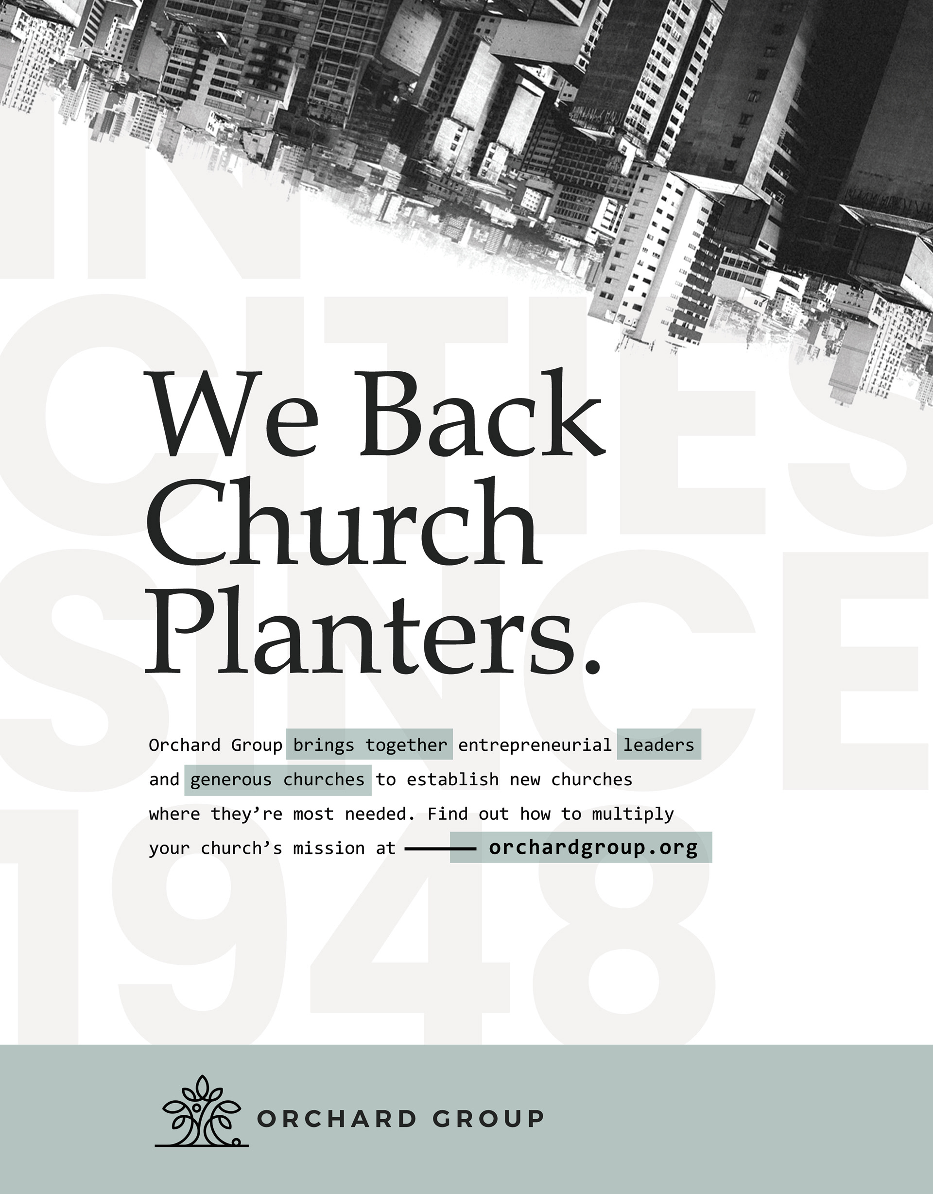
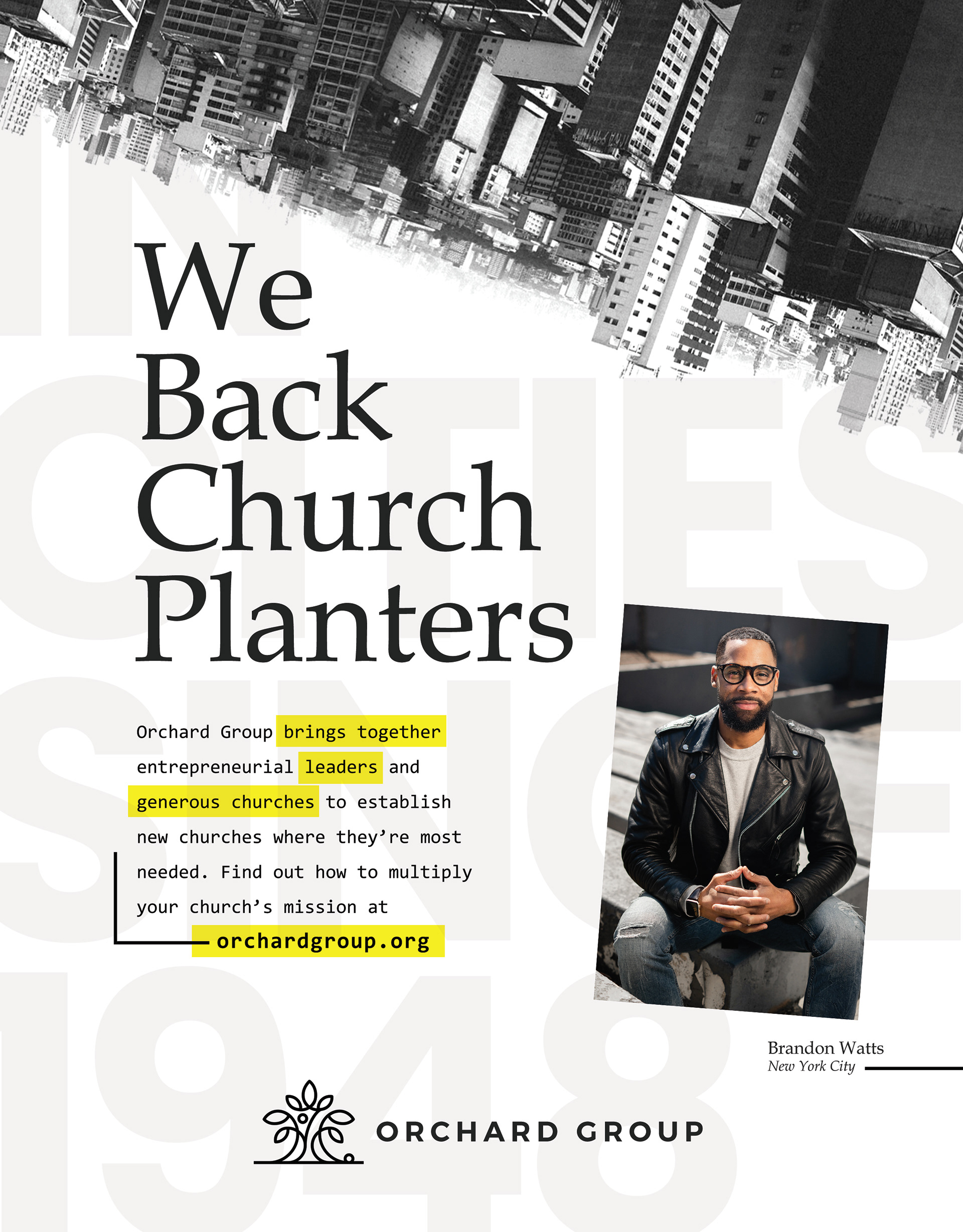
Orchard Group Ad - Option 5
Added call to action based on your feedback. I wanted to try a version where we leave a photo in. Two reasons: (1) Makes it seem more real (2) Photo could be switched out to run different planters in different publications.
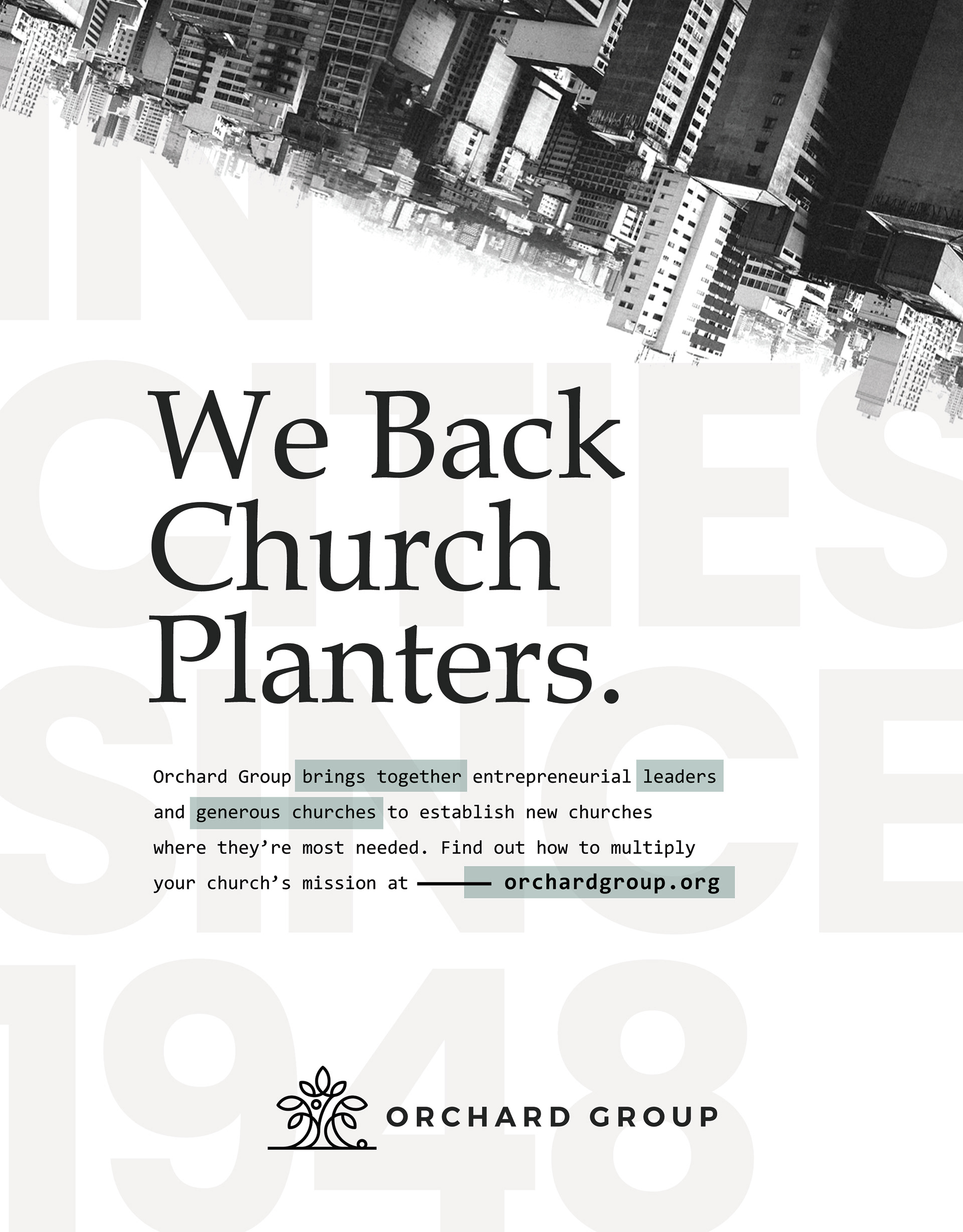
Orchard Group Ad - Option 6
I had a new idea when making your changes and looking through photos again. Just wanted to throw it in as an option.
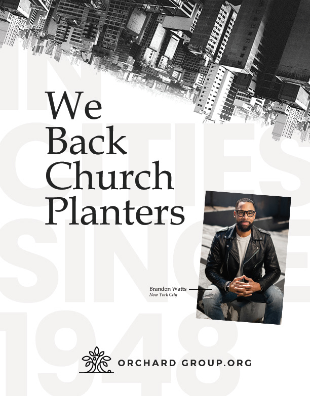
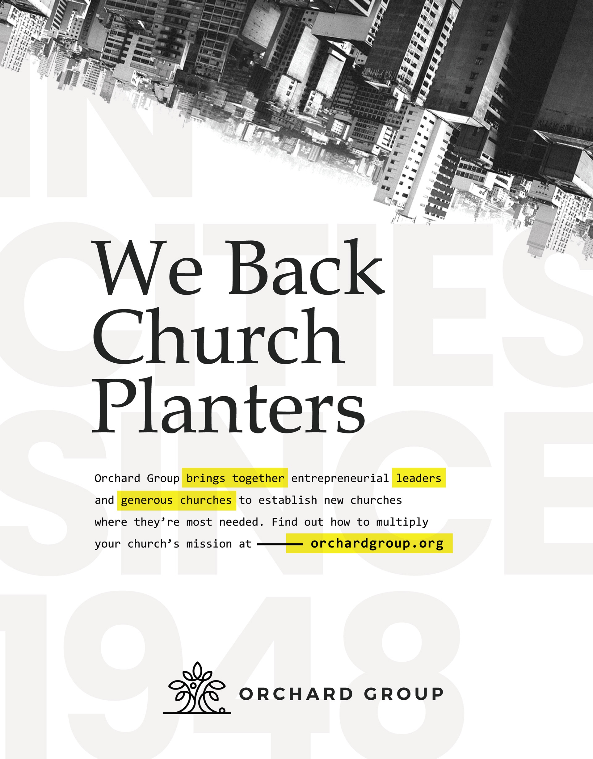
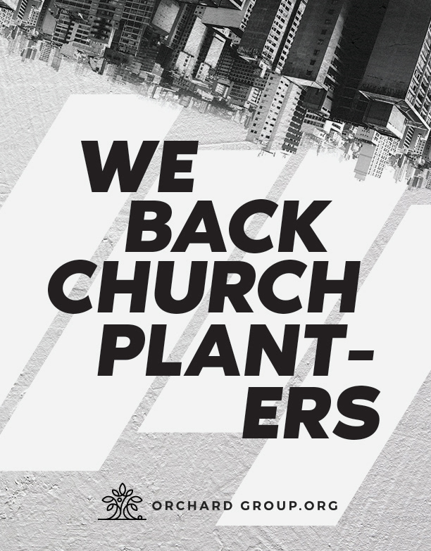
Orchard Group Ad - Option 1
Simple, urban, black/white design with clear text - "WE BACK CHURCH PLANTERS" - that will be hard to miss in the magazine.
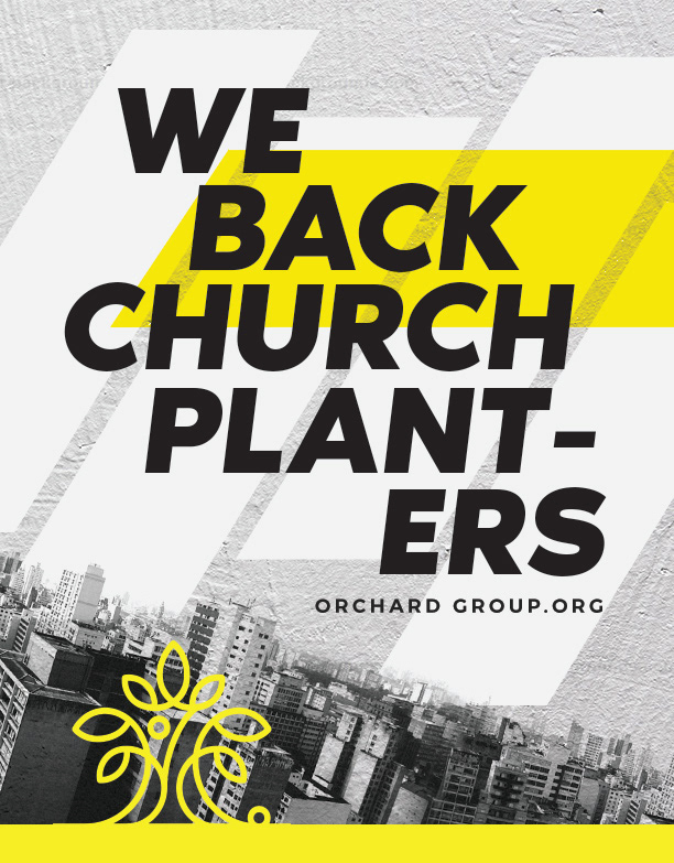
Orchard Group Ad - Option 2
Same ideas as above with bold color and elements rearranged.
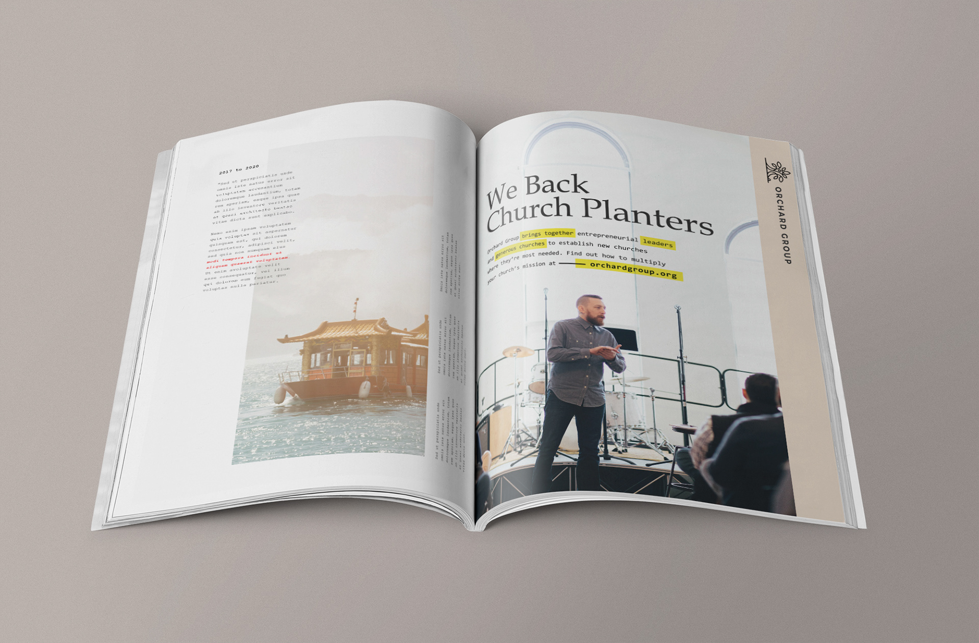
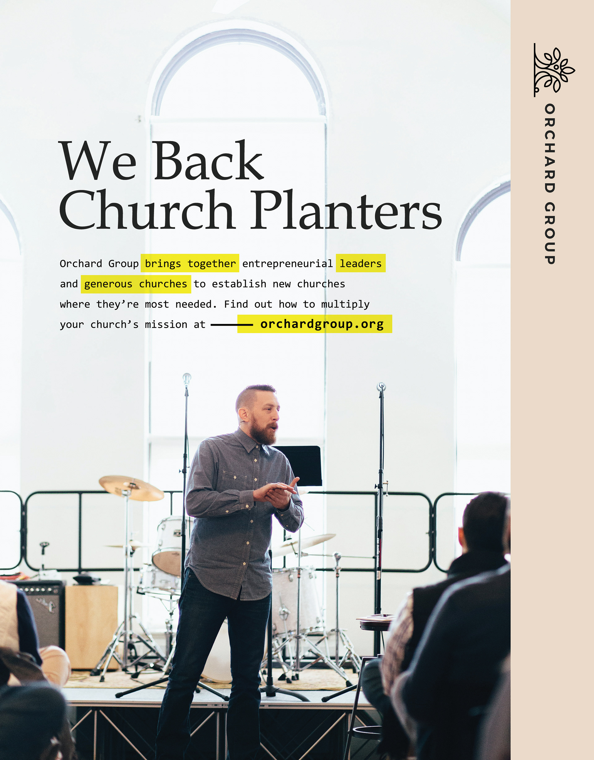
Orchard Group Ad - Option 3
I really liked the look of your new home page. I wanted to play off of those ideas. This ad has the feel of your new home page and is more personal because of the photo.